🟢 LESSON 2 PRACTICAL
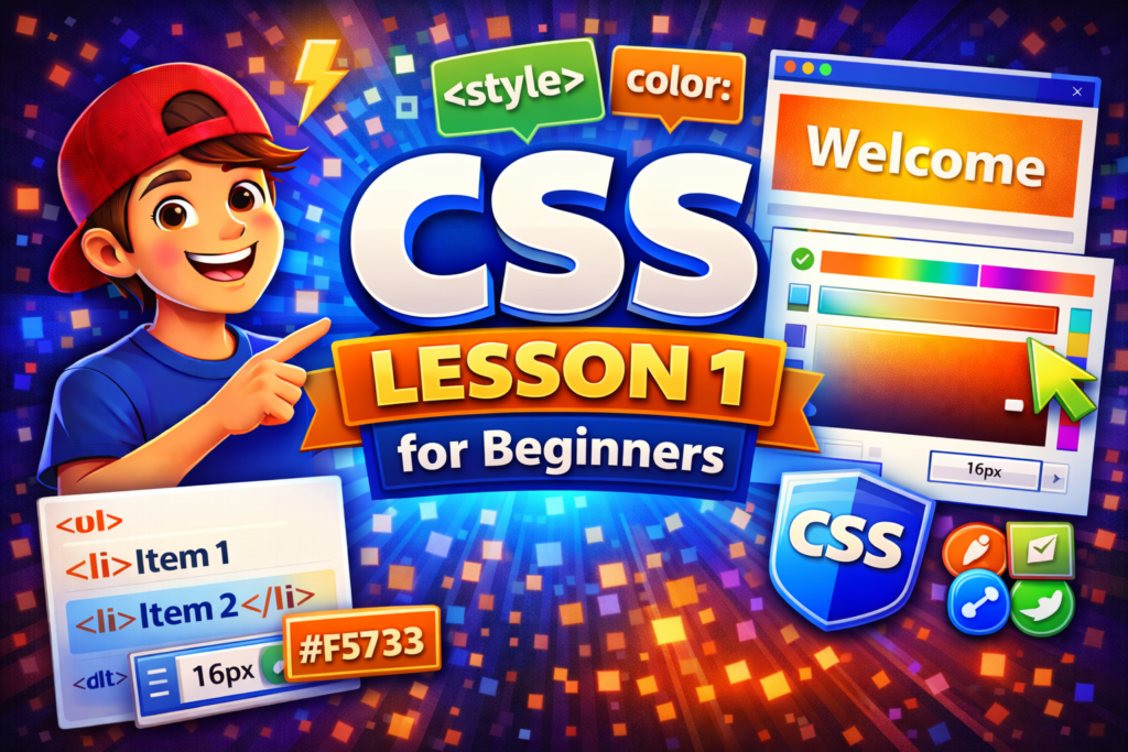
🟢 LESSON 2 PRACTICAL — Colors, Backgrounds & Card Design
🎯 Goal
You will learn:
- Better colors 🎨
- Background styling 🌄
- Build your first card UI (real-world component)
🧾 STEP 1: Update Your HTML
Replace your index.html with this:
<!DOCTYPE html>
<html>
<head>
    <title>CSS Lesson 2</title>
    <link rel="stylesheet" href="style.css">
</head>
<body>

    <div class="card">
        <h1>Welcome to CSS</h1>
        <p>This is my first styled card.</p>
        <button>Learn More</button>
    </div>

</body>
</html>🎨 STEP 2: Style Background
Update style.css:
body {
    background: linear-gradient(to right, #4facfe, #00f2fe);
    font-family: Arial, sans-serif;
}👉 Now your background becomes a gradient (modern UI style)
📦 STEP 3: Build a Card (IMPORTANT 🔥)
.card {
    background: white;
    width: 300px;
    padding: 20px;
    margin: 100px auto;
    border-radius: 10px;
    text-align: center;
}✨ STEP 4: Add Shadow (makes it professional)
.card {
    box-shadow: 0 4px 10px rgba(0,0,0,0.2);
}🎯 STEP 5: Style Text
h1 {
    color: #333;
}

p {
    color: #666;
}🔘 STEP 6: Style Button
button {
    background: #4facfe;
    color: white;
    border: none;
    padding: 10px 15px;
    border-radius: 5px;
    cursor: pointer;
}🚀 STEP 7: Add Hover Effect (feels alive 🔥)
button:hover {
    background: #00c6ff;
}🎯 FINAL RESULT
You now have:
- Gradient background 🌈
- Centered card 📦
- Styled button 🔘
- Hover interaction ✨
👉 This is already real frontend development
🧪 CHALLENGE (IMPORTANT)
Improve your design:
- Increase card width
- Change gradient colors
- Add:
.card {
    transition: 0.3s;
}

.card:hover {
    transform: scale(1.05);
}👉 This adds animation when hovering
💡 THINK LIKE A PRO
This “card” is used everywhere:
- Blogs
- Dashboards
- Apps
- Portfolios
You just built a reusable UI component 💼


odtbo3
mx5gw2
4xaa0m
zxpw0t
dlw0ij
iwqc88
Excellent resource that I will be returning to regularly, the depth of coverage combined with the accessible writing style makes it suitable for both beginners and experienced readers.
kr5aq9
This is precisely the kind of detailed and well-researched content that the internet needs more of, it is clear the author cares deeply about providing genuine value to readers.
I found myself nodding along throughout this entire article because every point resonated and felt grounded in real understanding rather than recycled information from other sources.
a6a9xn
A well-researched and thoughtfully presented piece that earns the reader’s trust through its honesty, depth, and the obvious care that has gone into every aspect of its creation.
This post was remarkably insightful, breaking down complex ideas into simple and accessible points so thank you for taking the time to put something this good together.